
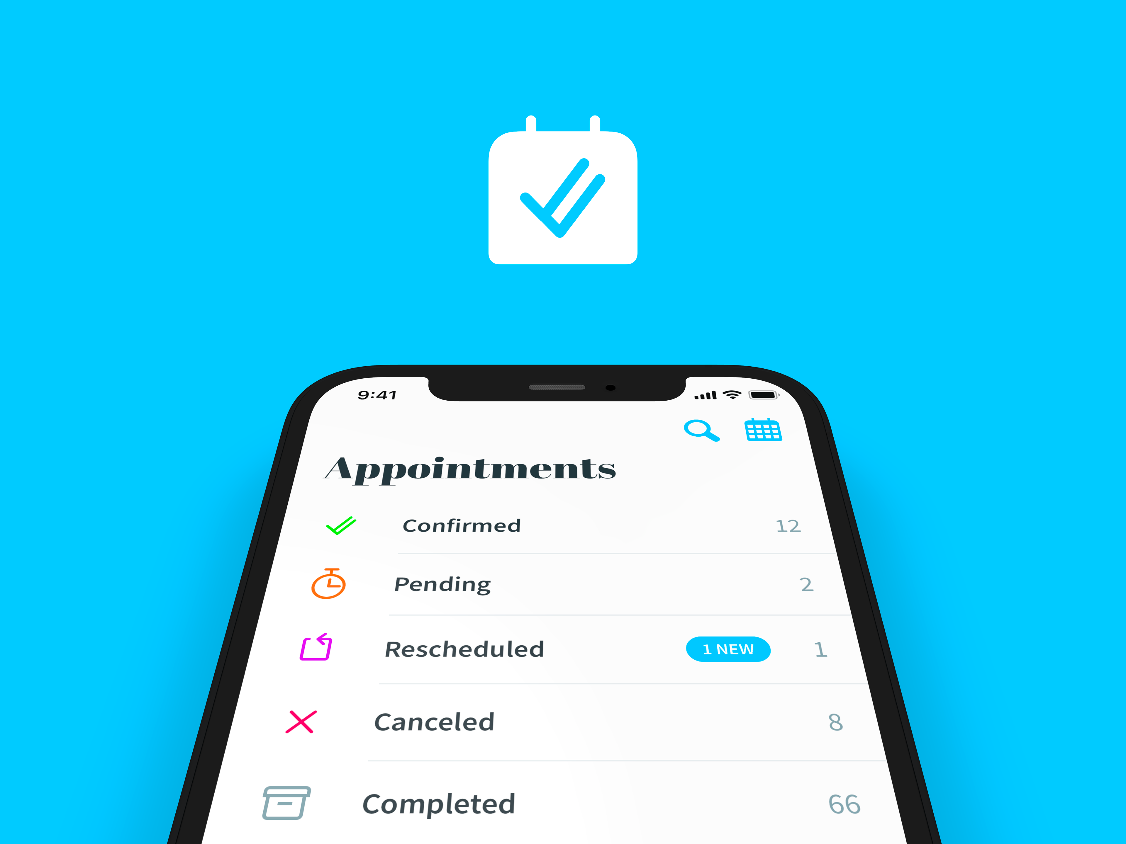
Consistently color-coding different appointment states helps users quickly identify what’s happening with their appointment.
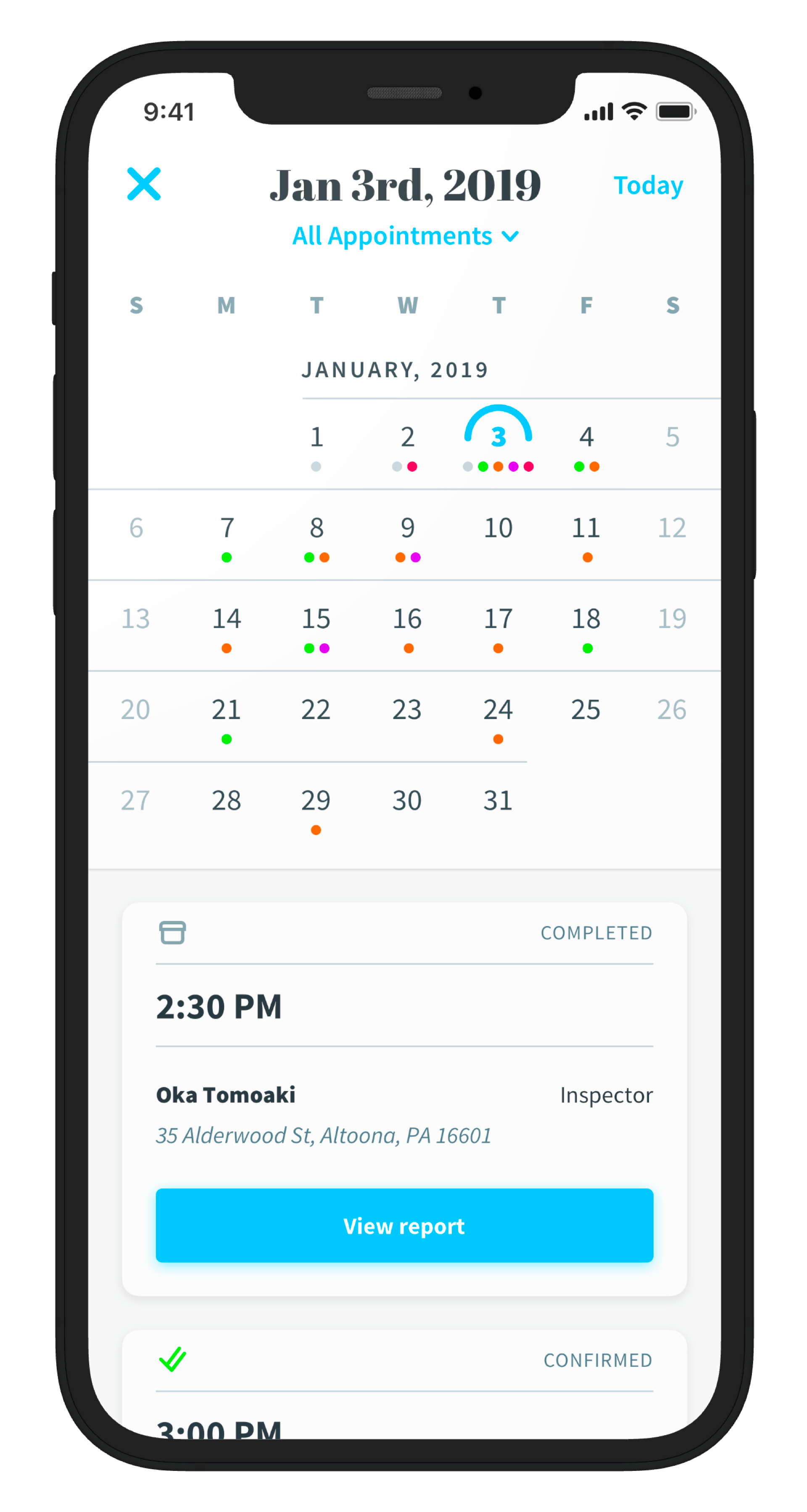
Through color, the design allows users to glance at their calendar and quickly understand how busy they are and what’s the current state of each appointment.
Design role
I was responsible for designing user flows, wireframes and also the final high fidelity user interface of the app. Overall look and feel, iconography and visual branding were also designed from scratch.
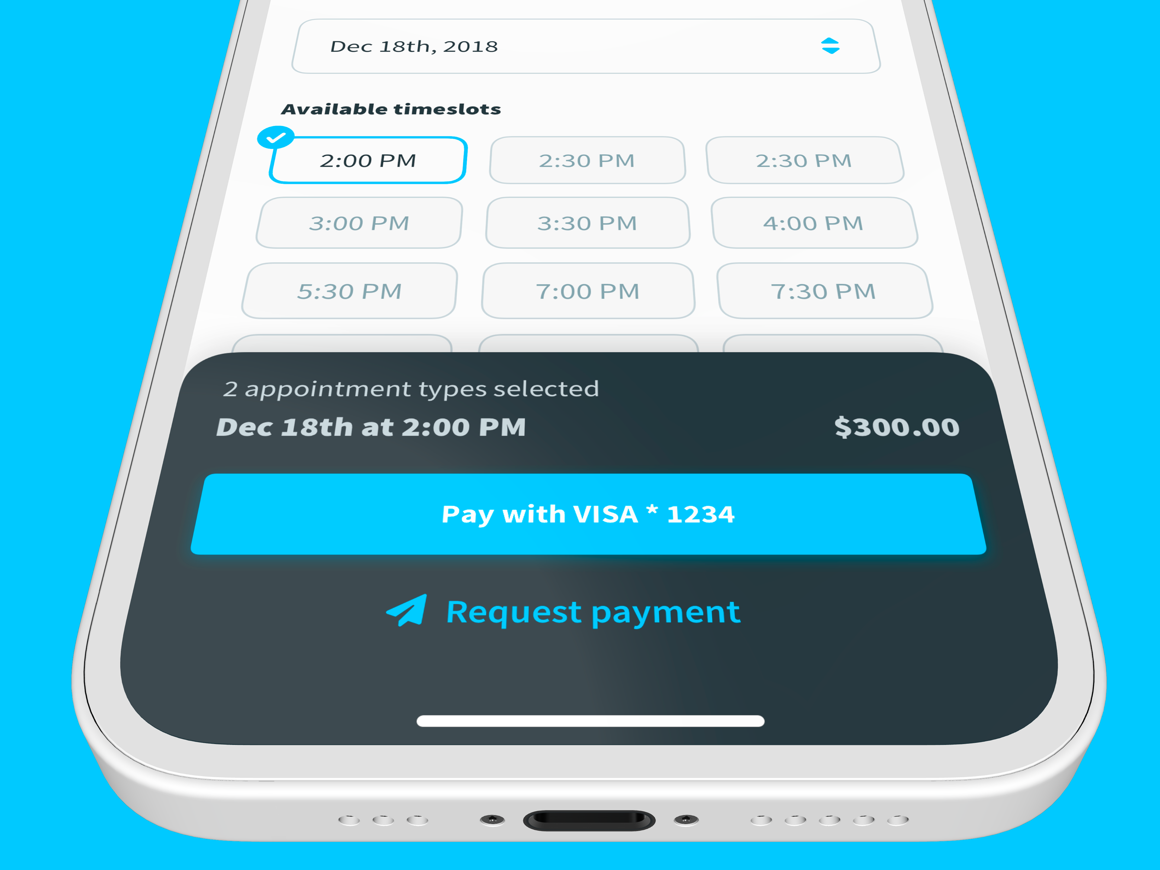
The app allows users to quickly schedule and pay for real estate inspections.

Sign in page.

Calendar view.
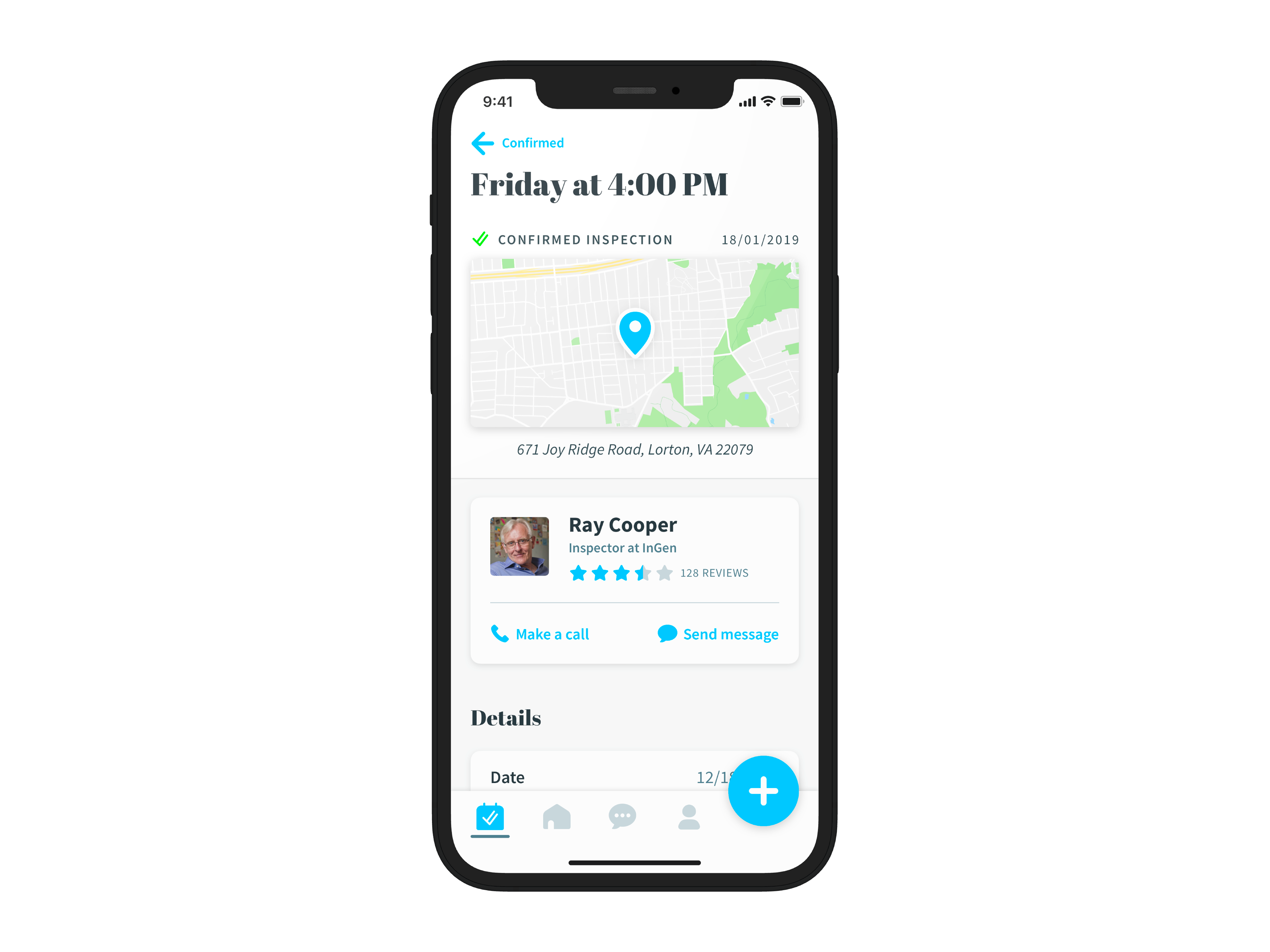
Inspection details.

Chat view.

An original iconset was specifically designed for the app.
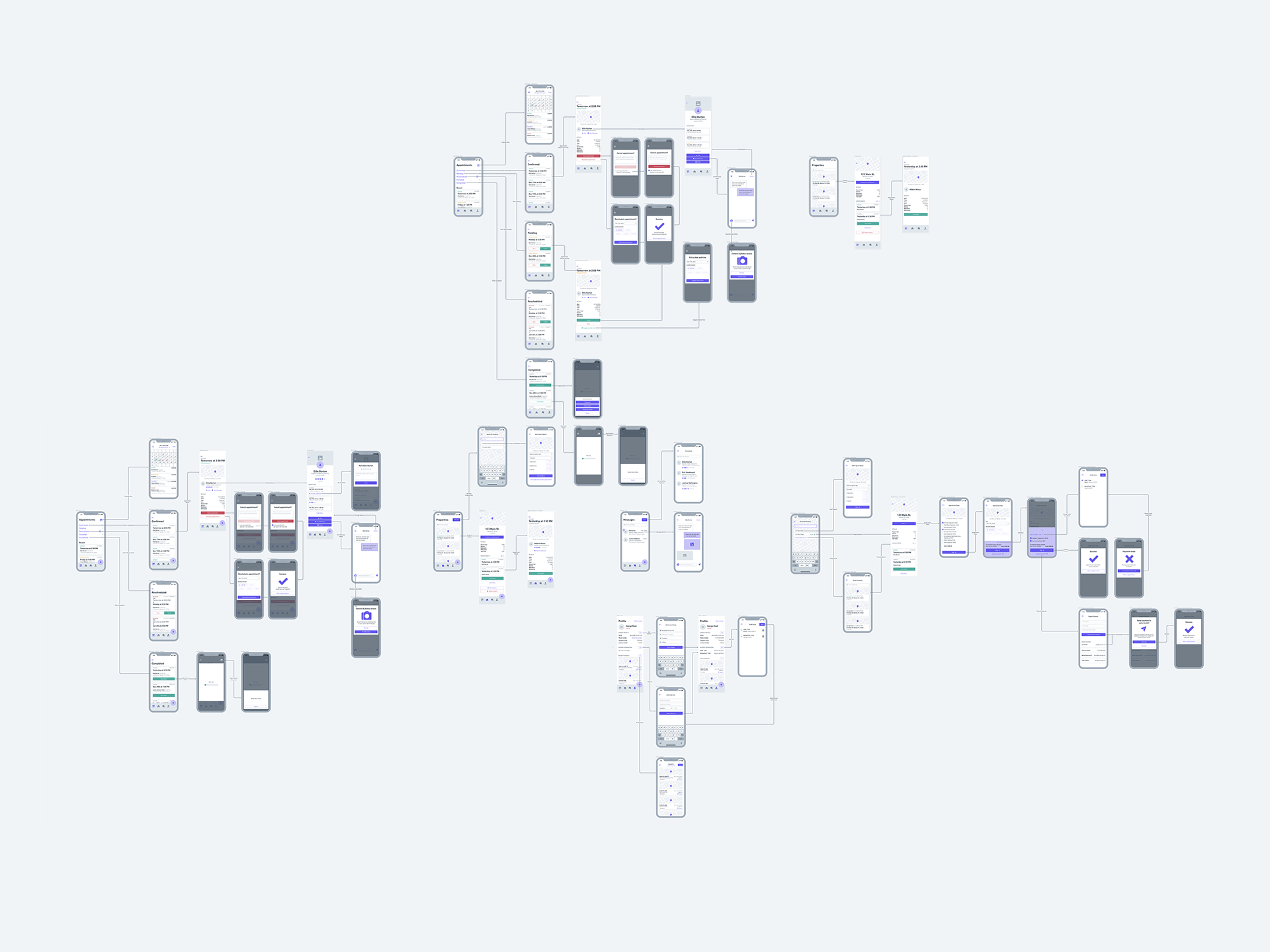
A variety of user flows were designed during the planning phase to perfectly accommodate all different main user types. After user flows were set up, the wireframing phase started and went through a series of valuable iterations.